I’m honestly struggling to contain the excitement I have for the new LimeCuda!
So I won’t…


You may be thinking this is just a new logo or a fancy new website. Those are definitely included but for us, this is so much more.
Let me explain…
Updating the brand
Even though 6 years feels long in our industry we’re still a young company learning where we fit in and can add the most value. We have been evolving and pivoting over the last few years. We try new things, learn from our mistakes, then push forward.
A consequence of this was that our existing website and brand no longer truly represented who we had become as a company.
When LimeCuda was born, the tagline was “Refreshingly Aggressive Web”. This made sense particularly for that time because there was a lot of opportunities on the web for helping small businesses. LimeCuda recognized that many small businesses weren’t capitalizing on this potential. So, the position was to get aggressive on behalf of our clients in taking full advantage of those opportunities.
We still think this underlying idea is great. However, when reflecting upon our most successful projects over the years, the common underlying element has always been the relationships that we’ve been able to cultivate with our clients.
In this context, the term “Aggressive” doesn’t convey a proper or positive personality trait for building great relationships. “Refreshing” does though :). So, we decided to fully embrace the “Refreshing” portion of the existing brand.
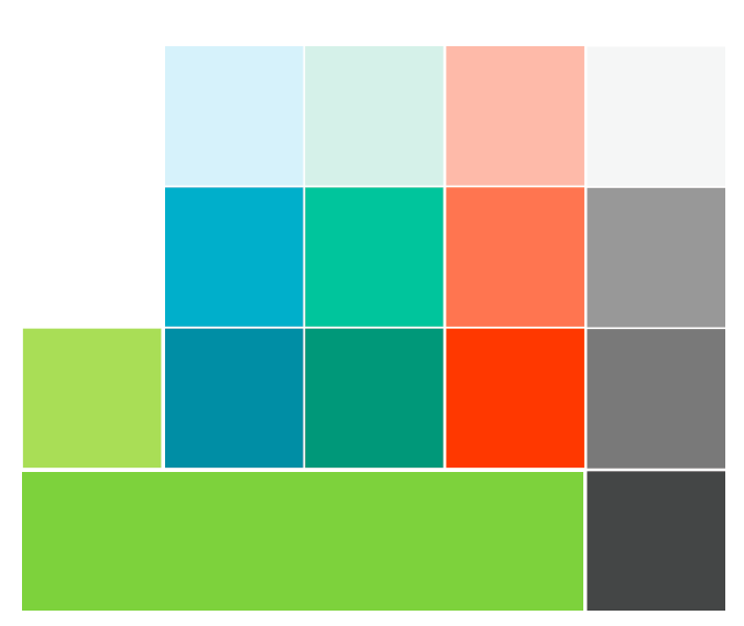
We are dropping the “Aggressive” terminology from most of our public assets. Pivoting the focus away from the barracuda portion of the LimeCuda name and toward the refreshing nature of the lime. This is now reflected in the updated logo and color palette.
![]()


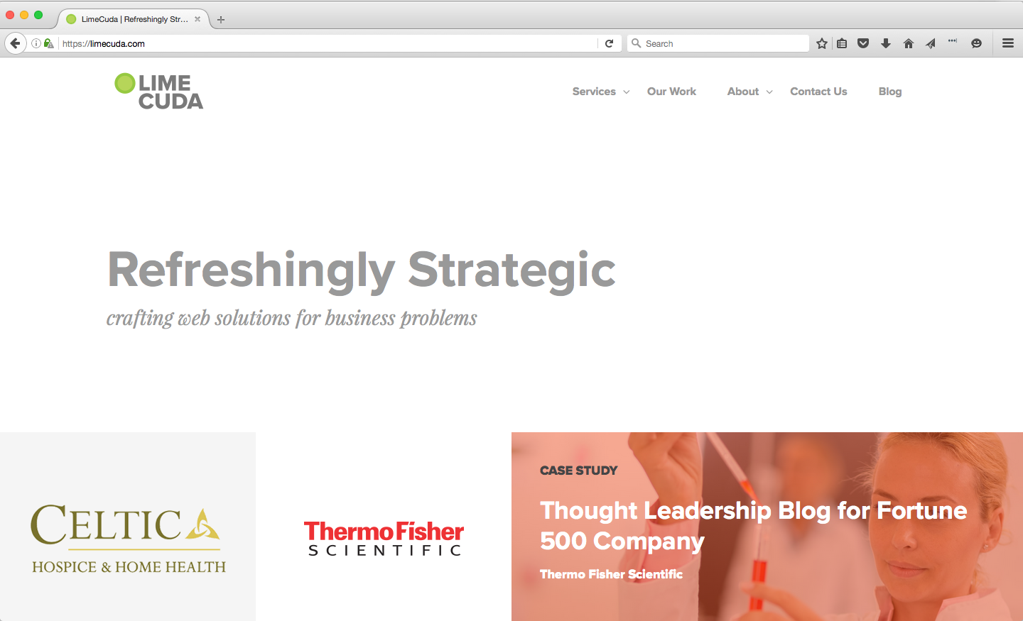
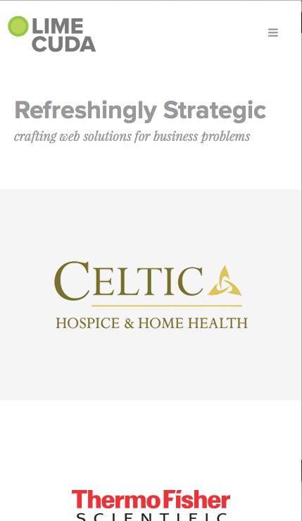
Crafting a new website
When designing the new website, our goals were pretty straightforward. We wanted to showcase our latest work with deeper substance as well as convey the value we place on great relationships with our clients.
So, we decided to start creating case studies for certain projects while also designing a way to sprinkle testimonials throughout the whole site. We added this into an updated design that matched the new brand and let simplicity really be our guide.


Practicing what we preach
One of the key things that we also wanted to approach with this “re-launch” was to be very intentional and regular with our blog postings and Social Media engagement. We’ve been preaching these things to our clients for years and have seen first-hand the amazing impact little steps in this area can have for a business over time.
We’re establishing strategies for engaging consistently but still adding value and not just noise. This should be fairly straightforward for us since we’re adamant about maintaining our own personality and letting that shine (with Blake being a good filter for the occasional edges in my own personality :) ).
We’ll also be experimenting with a posting calendar to help us stay on top of regular postings and optimize how-and-when we’re posting for the greatest impact.
Excuse to play around
Now for the fun stuff (or nerdy stuff if you will). This was my favorite portion of this entire process.
Working on a personal website gives us a chance to play around with a lot of new things. Here’s just a quick breakdown of things that we’ve played around with or implemented in this site build that we’ll be rolling out for new client sites:
- Created a project starter repository
In the past we had a starter theme and a core functionality plugin that we used when creating new client sites. We wanted to update this process. We created a starter git repository which includes our updated starter theme and core plugins in a single repository. We structured this to allow us to take advantage of WPEngine git set up for deployments. - Switched to Gulp for task running
Like most people, my first interaction with a Javascript task runner was with using Grunt. I still like Grunt, however there were certain benefits to using Gulp that forced me to give it a try on a recent project. I liked it so we decided to switch for all our future projects. We’ve now got it integrated nicely with our starter repository. - Mobile first
This theme was a new and deeper dive into building a website with a mobile first design approach. Is it perfect? Nope! But it was definitely helpful in allowing us to not only see the benefits of this approach when it comes to resource management, but also the benefits associated with having cleaner and more efficient styling process for mobile views. - Exploring new ways for managing dynamic content
One of the things we’re very passionate about is empowering our clients when it comes to managing their own sites. This is the main appeal of using a software such as WordPress. This passion drives us to explore usable and more intuitive ways for clients to manage more complex content elements on their site. Check out the blog post I wrote about how we’re managing this in our own Case Studies here.
You can check out previous site versions in this post.
We have much still to do, but as we tell clients, it is better to launch a new design if it is a big improvement than to spend years trying to perfect it before re-launching.
Launch and iterate!
We’d love to hear what you think, drop us a comment.